

Unless you operate as brick and mortar, your website is the first point of contact with their potential customers. Tiny blunders in messaging, structure, or performance causes friction that prevents visitors from converting.
Luckily, these mistakes are mostly avoidable. By being systematic in identifying them, you can either avoid them as a whole, or fix them with ease. Doing so will improve the number of generated leads, signups, or sales your site generates. Here are 10 of the most common website mistakes that you will want to avoid:
Mistake 1 ─ Confusing Messaging
Start by imagining that you are in your visitor’s shoes. Would you understand what the brand does based on the website within the first minute of landing on the page? The point is, if either your landing page (LP) or home page (HP) leads with jargon or vague statements, your visitors will drop from your site.
If users form an opinion about a website in 0.05 seconds, then clarity is not optional. It’s the antidote to your users leaving for your competitors.
How to Fix It
- Lead with benefits and outcomes your users get, as opposed to features. Instead of “Ramp Reps, Launch Products or Roll-out Best Practices in Weeks, not Quarters”, say “AI sales simulation platform to make reps productive in weeks instead of quarters.”
- Add a subheadline that explains the “how” in plain terms.
- Follow the rule of thumb: if your friends outside your industry can’t explain what you do after 10 seconds, rewrite until they can.
Example: Avarra AI homepage headline we used as an example earlier communicates scope of their platform in simple words, followed by a subline that explains the specifics of how they achieve what they set out to do.

Mistake 2 ─ Weak Calls-to-Action
If your users are not clear on how clicking your call to actions (CTAs) will benefit them, or what happens after the interaction, they will be confused and likely won’t convert. Form buttons with text such as “Submit,” or link text such as “Learn More” doesn’t really explain what will happen if they click.
A study by HubSpot found that personalized CTAs convert 202% better than default ones.
How to Fix It
- Use action-oriented language. Good examples are “Book a Demo,” “Start Free Trial,” “Schedule a Free Consultation” or “Download the Checklist.”
- Use the space above the fold to showcase your CTA and repeat placements and wording naturally throughout the page.
- Match the CTA with the page’s intent: if the page is of commercial intent, offer demos for buyers. Else if it’s informational, offer either newsletter signups, resource downloads, or both.
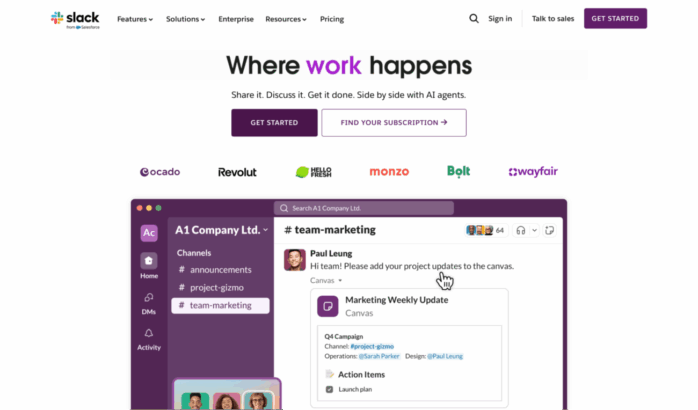
Example: The CTA on Slack’s HP is a great example. “Find your Subscription” is direct, one of the first things you see on page, and speaks to intent. That surely outperforms vague alternatives like “Explore pricing.”
Mistake 3 ─ Slow Load Speeds
Website visitors have little patience for slow performance. Google research shows that a 1-second delay in mobile load times can impact conversion rates by up to 20%.
How to Fix It
- Compress and optimize images and videos. The rule of thumb is to use WebP or Avif for images and WebM for videos.
- Use modern hosting and CDNs.
- Third-party scripts add to the loading time. Your options are to defer them, load them async, or get rid of them as a whole.
- Run a monthly audit using tools like Google PageSpeed Insights or GTmetrix. Videos always add to the loading time, so make sure you’re clear on your priorities.
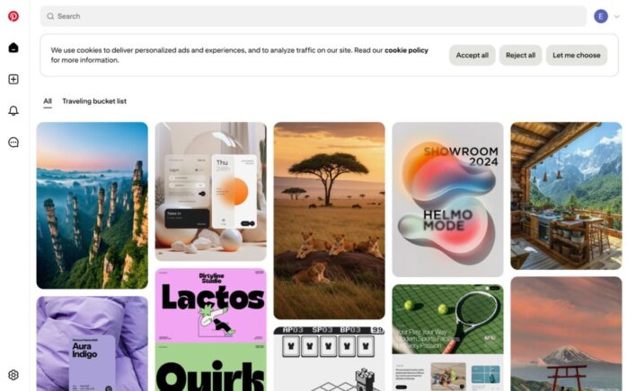
Example: Pinterest increased search engine traffic and signups by 15% after cutting perceived load times by 40%.
Mistake 4 ─ Cluttered Navigation
Overloaded and poorly organized menus is a surefire way for your visitors to get lost and unable to find whatever they were looking for. Yes, it means they will leave.
Based on various researches, poor navigation design accounts for nearly a half of site abandonments during e-commerce browsing.
How to Fix It
- Limit top-level navigation to 5–7 categories.
- Group related pages under logical dropdowns.
- Include a visible search bar for content-heavy sites.
- Test navigation by asking non-team members to complete key tasks.
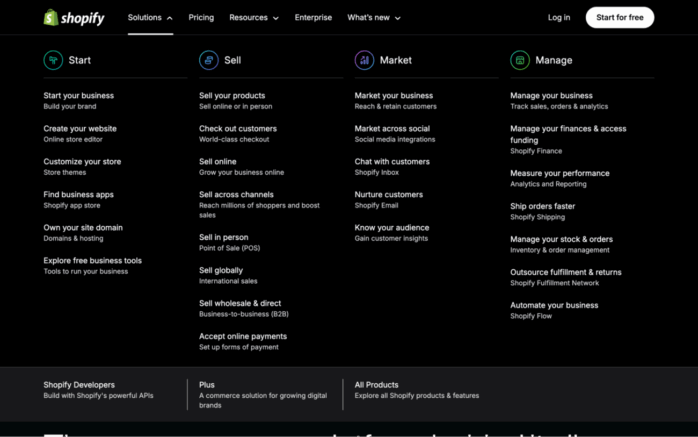
Example: Shopify has a brilliant way of organizing their navigation. They do it in a way where the buyer is the hero, and depending core journeys the visitors take, they give you the tools to ”start” your journey, continue “selling” your products, “marketing” your products, and improving “management” of your business.
Mistake 5 ─ No Social Proof
Without proof that others trust you, visitors hesitate. Social proof reduces risk and builds confidence.
According to BrightLocal, 46% of consumers trust reviews as much as personal recommendations.
How to Fix It
- You should show your client / customer logos, partnerships, and integration logos.
- Add as many testimonials and case study snippets. The goal is to show outcomes your buyers have reached through your help.
- Display user counts, adoption stats, or press mentions.
- Include ratings or awards where applicable.
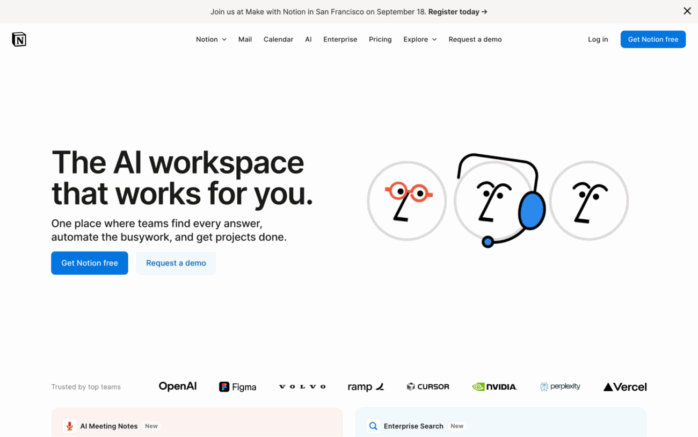
Example: Notion’s homepage features logos of global companies and community testimonials, reinforcing credibility instantly.
Mistake 6 ─ Ignoring Mobile Users
Over 60% of all web traffic worldwide is using mobile to surf the web. On one hand, if your site isn’t optimized for mobile, over half of your audience will find your site inaccessible. On the other hand, it’s not related to B2B segments as around 80% of B2B traffic comes from desktop devices and they almost never convert.
The verdict? If you don’t want to make your visitors happy, at least make Google happy and optimize for mobile.
How to Fix It
- Use responsive design. Cascading Stylesheets (CSS) is a basic web technology that’s very helpful in making it happen.
- Test buttons and forms on mobile devices. Ensure tap targets are big enough.
- Optimize visuals for small screens. If it doesn’t scale well, you might want to consider using a different visual asset.
Example: Dropbox stacks the layouts vertically. The brand also uses large CTAs with lots of white space on mobile, ensuring the experience is as frictionless as desktop.

Mistake 7 ─ Weak Forms and Lead Capture
People are lazy, The shorter your forms, the less users will bounce. Studies show form length directly impacts completion rates, with conversion dropping as fields increase.
How to Fix It
- Keep forms short, asking only for essentials. Usually full name and email suffice.
- Use progressive profiling: gather more info over time. You can always use enrichment tools to enrich the collected data through email.
- Add clear labels and error handling messages. Those help users with their expectations.
Example: After testing a shorter lead-gen form, HubSpot and saw conversions increase by 50%.
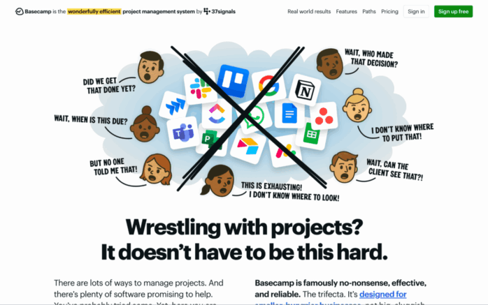
Mistake 8 ─ Stocky, Generic Visuals
I’m not advocating for spending a lot of money on custom visual assets and UI. Those can get expensive fast. However, the more generic your visuals, the more your site looks like a cookie cutter template. “If you don’t put thought into your site, you don’t do it when it comes to your product either” is a common thought process.
How to Fix It
- Use original product, team, or customer photos.
- Create branded visuals that reflect your identity.
- Replace filler stock with graphics that explain value.
Example: Basecamp uses team photos and custom illustrations, creating personality and differentiating from competitors who use the same stock assets.
Mistake 9 ─ No Clear Funnel Paths
Don’t let your visitors think about the wrong things. They should never wonder where to go next or what to do next. Make sure to have a clear funnel path through interlinking on site. This way you will decrease drop-offs.
How to Fix It
- Map journeys: homepage > product overview > proof > CTA.
- Use consistent CTAs across sections of each page.
- Ensure no page is a dead end.
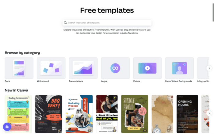
Example: Canva guides users from signup > templates > editor seamlessly, ensuring the funnel feels intentional.
Mistake 10 ─ Neglecting SEO Basics
Even the best site won’t convert without traffic. Ignoring SEO means fewer opportunities to win customers.
How to Fix It
- Conduct keyword research tied to intent.
- Optimize titles, metas, headers, and alt text.
- Build internal links to strengthen authority.
- Publish content that targets top, middle, and bottom funnel keywords.
Example: Ahrefs rebuilt its blog with intent-driven content and saw traffic grow to over 3 million monthly visitors.
Conclusion
Conversion-focused websites succeed because they avoid common pitfalls. By fixing weak messaging, poor CTAs, slow speeds, or missing proof, you remove friction and create a smoother path for users. Every improvement compounds, leading to more signups, demos, or sales.
But here’s the sharper takeaway: websites are not static assets. They are performance signals that investors, customers, and search engines judge within seconds. Research shows 94% of first impressions are design-related.That means design and messaging aren’t just cosmetic — they directly influence trust and growth.
A website is not just a brand presence, it is a performance engine. Treat it as such, and it will reward you with measurable results. If you want expert help in building or optimizing one, hire a Webflow Development Company specializing in creating sites that perform, convert, and scale with your business.


